The new “Dyslexie Font” has been created that is reportedly able to unscramble the letters many dyslexics confuse. The font is currently under judicial review and very well may be implemented across the nation and abroad.
As a dyslexic himself, Christian Boer, the creator of the new font, experienced great troubles throughout school whenever he was assigned a reading segment. Due to his condition, he would often scramble up letters and misinterpret the words on the page.
While studying graphic design at HKU University of the Arts in Utrecht, Holland, Boer decided to do something to lessen the difficulty of reading for people in a similar position as him. The result: a font that tweaks letters in order to make them easily distinguishable for the brain.
After observing the common features of dyslexia, Boer found that many dyslexics had a much easier time comprehending 3D letters, as opposed to 2D letters, which account for a majority of fonts. Using his graphic design skills, Boer transcribed 3D letters into a 2D format, thus allowing dyslexics the ability to read with relative ease.
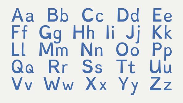
The font itself is very asymmetrical, with the goal being to help readers more easily distinguish similar letters from each other.
In an interview with the BBC, Boer explained, “It is like fixing a brick onto a bicycle wheel. If you turn the wheel, the brick will always fall to the bottom. With the letters, if you turn them upside down, they look unnatural as the heavy side should be on the bottom.” Instead of keeping letters uniform and easily confounded, the Dyslexie font helps letters stand out from each other by instating “heavy bottoms” and coloring the text blue, making it easier for readers to differentiate letters that look similar, such as the letters “h” and “n.”
At Riordan, the discovery of his font is relevant, as the
Resource Specialist Program helps serve students who have been diagnosed with learning hindrances. Director of Riordan’s RSP Program Nate Simon ’99 explained, “Every person who is dyslexic has a different way of describing what happens to the letters on the page when they read. Some describe letters as floating, some really struggle with the spaces in between words and it looks like words flow together. I think the jury is still out on whether this font can change this for dyslexics, but it is interesting and I’m glad someone is working on it.” The font, which is now available for download from their site, provides hope for the more than 700 million people with dyslexia.
An ARHS RSP student, who did not wish to be identified, said, “If this new font proves to be something effective, then it could make my life so much easier. I hope it will take away all of those nights where I have to read for school and I feel helpless and defeated because I can’t hold on to the information I’m reading.”
Of course, there are difficulties with providing this new font. According the Simon, “I think this font could help some of them, but getting readings from digital textbooks to a PDF and then changing it into this font is a lot of steps and very time consuming, so the big issues of reading textbooks won’t really be helped by this font unless publishers start using it.”
However, the font could be very useful when reviewing and editing essays for school. If students were able to construct their essays with a more manageable font, they would have an easier time reading their own writing. Creators hope to “help people make their way through the daily letter jungle and make reading, learning and working fun again.”