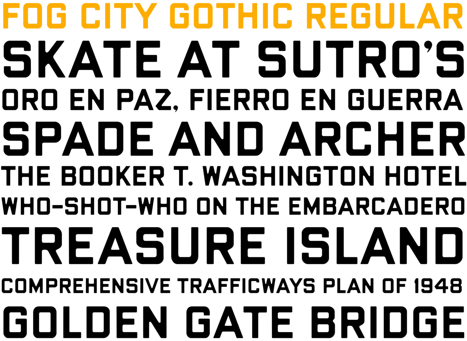
Amateur typographer Ben Zotto has created a new font—called Fog City Gothic— styled after the all-caps style of San Francisco street signs that were replaced in 2009.
Those older signs were once embossed in metal then painted over, creating a look that Zotto described as “Bold and blockish, but soft around the edges” in an interview with the San Francisco Chronicle. The more recent, but still fully capitalized signs, were replaced with mixed case signs on more reflective backgrounds in an attempt to improve their legibility.
One member of the Riordan community who grew up with the old street signs is English teacher Micheal Vezzali-Pascual ’88, who also read up on the font upon hearing about it. He was very happy with the classic San Francisco look of the font, and noted that Zotto nailed the resemblance to the unique original signs.
Meanwhile, History teacher Jeff Isola was slightly less impressed, saying only that “I think anybody who is used to the old street signs would recognize it, so sure.” He believes that it is fairly close to the original, but doesn’t know if it is quite exact.
Even so, Vezzali-Pascual is happy with the font, claiming that “it has that classic San Francisco look. No one else in the world has street signs like us.” Vezzali-Pascual even said that he would happily use the font, if only because he liked it.
The font is available for download on Zotto’s site, and seems to be the only font he is planning to create.